Hattie Stewart: The Colour Pink Should be Celebrated!
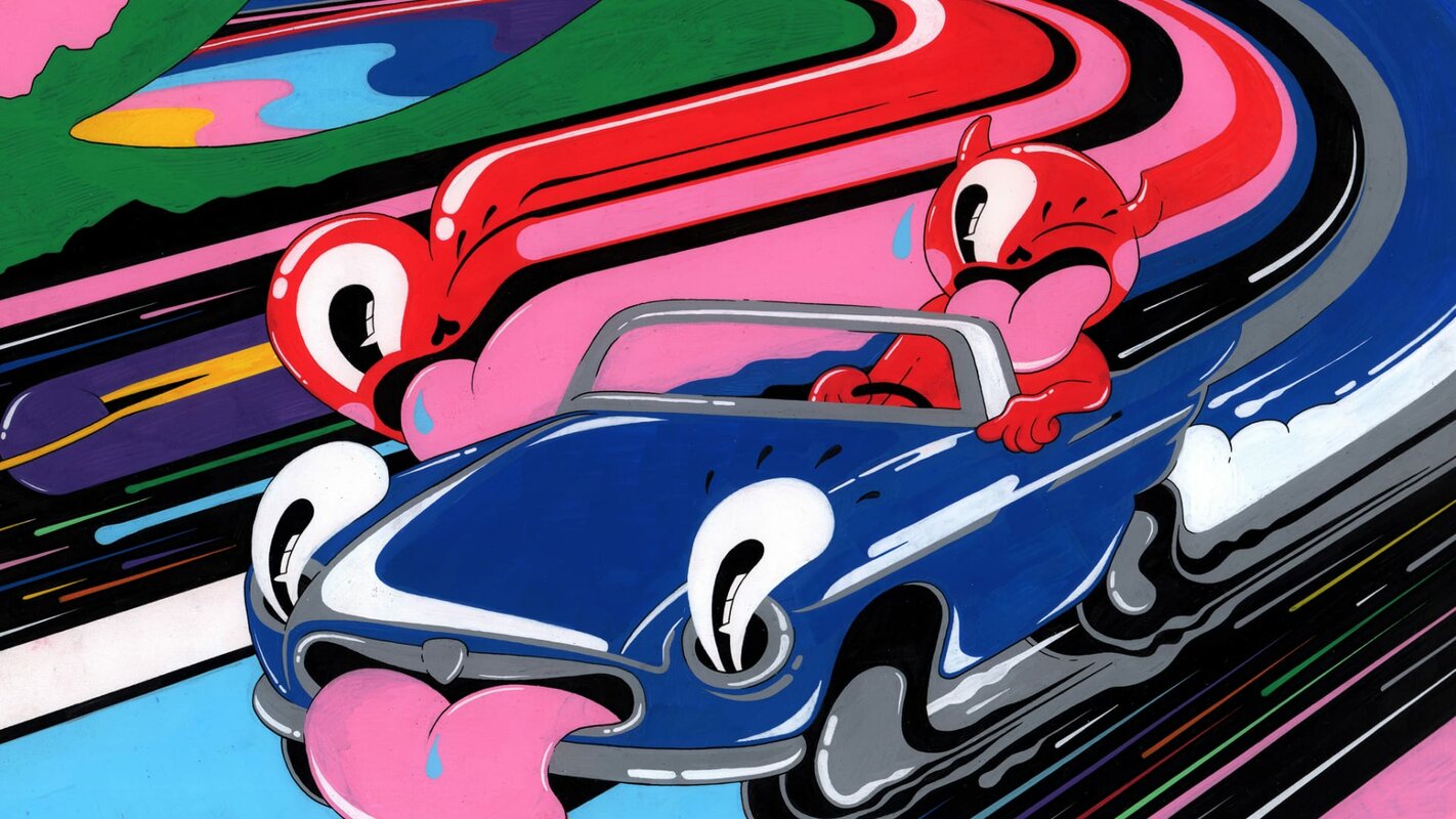
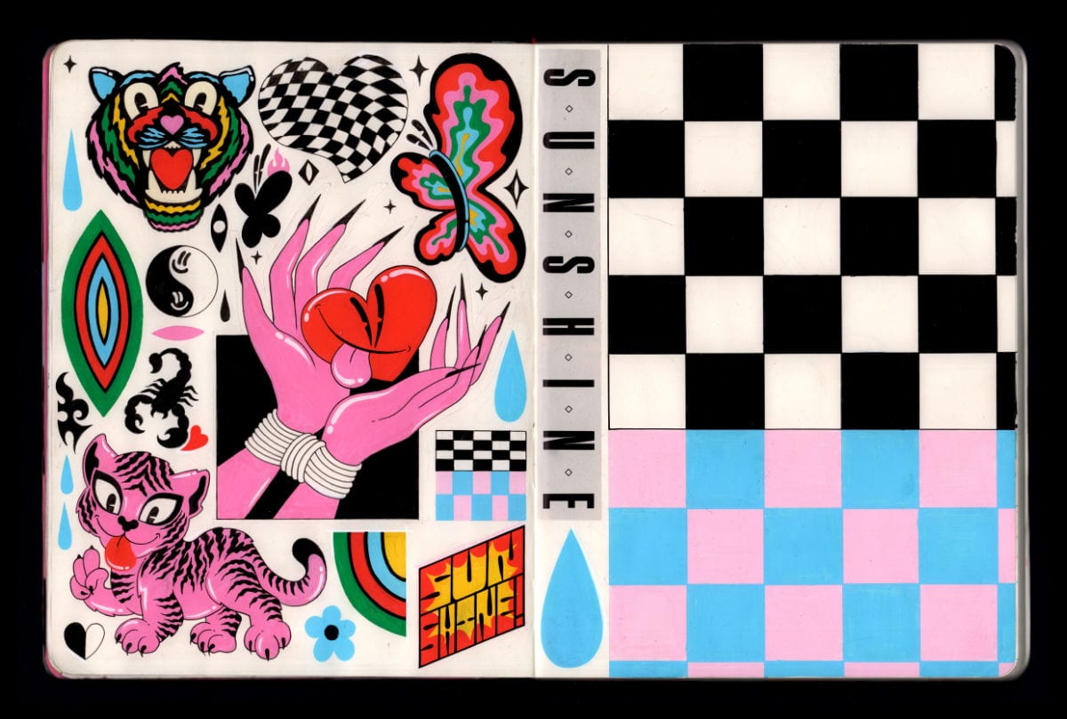
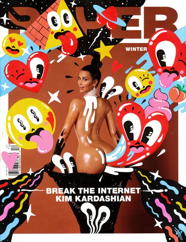
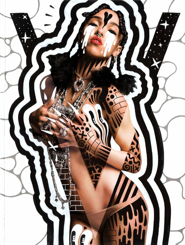
Hattie Stewart is a self-proclaimed ‘professional doodler’ with a unique and playful illustration style that extends itself through the worlds of advertising, art and fashion. Her drawing over the covers of influential publications such as Interview, Vogue, i:D and Playboy has formed the basis for most of her commercial projects and endeavours. Her work is bold and experimental in application, enabling her to eschew the more traditional boundaries within the field of illustration.
Pictoplasma: We would like to start at the beginning, to understand how you found your own voice; because you have a very strong visual identity and voice.
Hattie Stewart: Thank you, that's very nice to hear. I've drawn obsessively ever since I was a child. You never really know which direction your style is going in or what something is going to become until you're at a place where you have enough to look back on. Then you see; oh look, I was exploring that back then, and that it's all a journey. I was drawing cartoons and replicating what I saw in my comics; Beano, Dandy, Beryl the Peril or Micky Mouse. Inevitably, those influences embedded themselves in the core of my work. There's always going to be some kind of link and story there. It's very different today because as a child, I could barely hold a pen. Now, I think I'm more or less competent! But yeah, it's interesting to reflect on the journey.
"There's always a darker undertone to my work."
As a child, you were probably more into cuteness than today. People would say hearts and flowers and all the colourful cheeky stuff you do is still very cute. But we would say that it's so cute it makes your eyes bleed. It’s about the aggressiveness of cuteness. Can you relate to that?
Yeah, it’s the same with being called kitsch; it can be a little bit offensive. I get labelled ‘cute’ a lot, and it's not a word I'm really a fan of. I think that being a woman and inevitably doing more feminine characters or shapes means that you just get put into that box. There's always a darker undertone to my work, and weirdly, when I was a child, I drew really horrible stuff. In uni I did a whole project called Little Slices of Death, which was gross. I did one vaguely pornographic graphic novel, which I shouldn’t get into – it was vulgar. I have always had an underlying interest in the macabre. As a young illustrator trying to find some ground, there had to be some level of commercial activity in my work, and I think that's when the more playful characters came along. When people respond to those really positively, it's hard not to include them more in your work. But I always see the dark undertones.
"Pink is an incredibly strong and multi toned colour. I love it."
Do you feel as though you’re in a strong place in regards to being a woman? And do you feel that you are part of a new feminist movement?
This kind of conversation has gone on with female artists for years. I refused to use pink because it was considered feminine and therefore not important. Now it's like, well fuck it, if I want to use pink, I want to use pink. Why is that a negative thing? Why is something feminine seen as something negative? It should be celebrated. It’s an incredibly strong and multi-toned colour. I love it. Even the art world is male dominated, so feminine themes make you feel that you could be excluded from certain areas. We're making our own areas now. Also, as an artist, I don't think that besides being a woman, I make feminist work. Other people may agree or disagree, but I don't necessarily like being called a female artist, or for my work to be described as being about my gender. Because it's not at all. My work is just my work. It's just stuff I like.
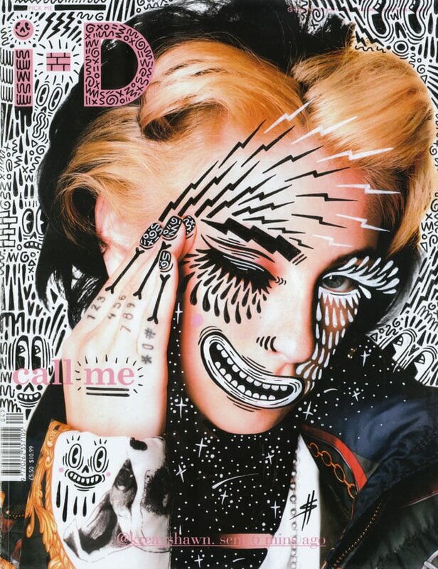
Let's take a look at the doodle bombing you do with erotic or porn magazine covers. You’re a woman appropriating content that is targeted at male audiences, turning and twisting it into something different. We don’t think you can take a gender-neutral perspective here, and that’s good!
That’s fair enough. In the context of the covers, they're part humorous and part satire; it’s a collision of sorts between two ideas. It's a dislike of something, but it's also a love and obsession with something, whether that be beauty, or femininity or sex. I can never really answer a question with a very straight, clear answer, because it's always a conversation. One day I say I'm a feminist artist, the next day I say no, feminism has nothing to do with my work.
"It was kind of gross, very punk graphic, not really what I do now."
When did you start painting these magazine covers?
I was working in a bar in east London and was bored out my mind. I thought about what I could be doing and how to get my work out there. I was drawing away mindlessly over this picture of Biliana, then I just thought: Oh, that looks freaky, I kind of like that! And because I've always been an avid collector of magazines, I went home and got a huge pile and just started playing with it and drawing on them.
It was kind of gross, very punk graphic, not really what I do now, which I feel is more considered. It was something of an attack. But I recognised something interesting, something I really liked, and it was a nod to this stuff that I loved as a younger kid; a style that came out of the 1960s and 70s, like Martin Sharp with the Cream covers, Disraeli Gears, all my favourite stuff growing up and stuff that I studied in college. I came to an inevitable crossroads.
This work became pivotal in how I engaged with social media. When I shared this work, people really enjoyed it and I gained a following. That was obviously very encouraging. I carried on and on, and it slowly grew.
Now, in regards to commercial brands and stuff – which I hadn’t originally intended to get into – there's so many more demands on a project: it's not just advertising, what I produce is also going to be used as social media assets, stickers, product, in-store activation. There's a whole plethora. My work engaged with that very well. I was really fortunate that these opportunities arrived through exploring my work in my own way, how I wanted to express myself. I never wait for something to come to me. I just create what I want to make, and that brings in opportunities. It's all an exploration.
At one point, as with most artists, I felt the pressure of social media. If a big thing came out, like the infamous Paper Magazine cover ‘Break the Internet – Kim Kardashian’, I felt that I had keep up with the momentum and constantly respond. Then I thought, that's not for me, that's for other people. That doesn't make me do good work. I realised that there was a long period where I was doing covers that were kind of gross. They weren't considered, and it was just so slapdash.
In the last couple of years, I've wanted to slow it down a bit, just focus on creating pieces that actually have a bit more context, that are more interactive and have more depth and detail. I don’t feel that pressure to do things quickly because I need to get something online. Now it’s rather, I'm going to create a piece of work that I enjoy sitting with, that I'm visually excited by afterwards.
The work is very two dimensional, really flat in a good sense, it's all about the surface. But you started doing exhibitions, bringing your work into three-dimensional space. Let's take a look at an exhibit you made in 2016.
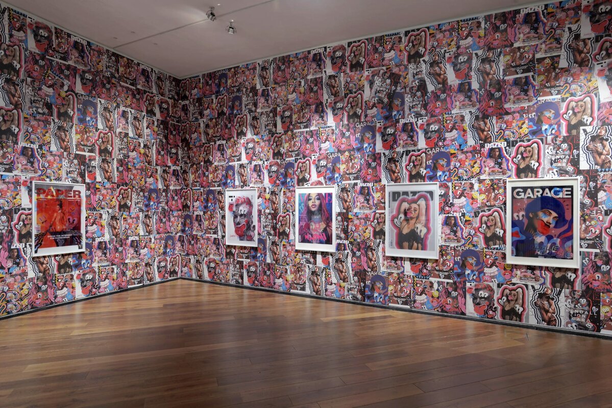
That was at First Site Colchester, which is actually in my hometown. They were doing an artist’s room exhibition about Andy Warhol, and they'd seen my work and knew that I was a Colchester artist. They brought me on board to do my thing, and at that time I was really going in on the covers. They gave me a huge space. Considering I work so small, I wondered how I could make it engaging and interactive. One of the interesting things with the covers is ‘the before and after’; the original context and how that context is transformed through illustration. I thought, how can I show that in a static space and make a 2D flat image come to life where you can see the flip between? Then I had the idea of making lenticular pieces, bringing the original and the illustrated sections together in one image.
We printed these lenticular images super, super big – A0 size – which was really cool. Then I decided to fly-poster, completely covering the entire room with all the magazine covers so it would be very intense and in your face. Because that’s what media is like; we’re constantly bombarded by it. The exhibition was a little nod to that.
"There's a very dismissive attitude that illustration is just an accompaniment to something else."
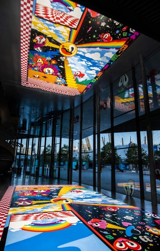
As busy and radical as it was, it was still hanging pictures on the wall, even if you had two layers. But an exhibition you did later at Now Gallery, London, in 2018, was something else. You really played with the three-dimensionality of space and the two-dimensionality of your work.
I'm always thinking about how my illustration, which is flat on the page, can take up space and incorporate itself into space. I've made tapestries, lenticular prints, wallpaper boards… in every single show there's been an experiment and something a little different, a way for me to play. An exhibition space is often awkward or really big or really small with loads of corners. The Now Gallery is a huge, curved architectural space that's pretty much all glass with no walls. How on earth do I put my artwork into this space? For a few years, the idea of how I could make viewers physically part of the illustration had been on my mind, and the mirrors installed in the space seemed to be a way to unlock that box.
I've always wanted my work to have some kind of interactivity with the viewer because my work is in itself interactive with the covers, kind of like an inception. With this show, I thought: why don’t I just take up the space with one big flat illustration? But it has layers within it, and then you lie down and look up, and you're a part of the illustration, of the art-work. It's a chaotic yet relaxing space. It's two halves. It was meant to be fun and have some level of engagement.
There's often a very dismissive attitude that illustration is just an accompaniment to something else, but it's so rich, there's so many forms of illustration, there's so many ways it can be applied and so many stories that are told. It covers so many incredible bases. Ever since I was in uni – an incredible but traditional university where I didn’t always fit in – I’ve been thinking of ways in which I can demonstrate illustration in its full range of capabilities and thus elevate it as the incredible artform that it is. I used to dislike being called an illustrator; I wanted to be called an artist. But now, I’m like; No, I want to be an illustrator because we’re doing pretty well!
We think that’s an amazing plea and advocacy for the genre of illustration. We feel totally the same, but we also feel that illustration has changed, and you are part of that change. Thank you so much.
Interview by Pictoplasma on the occasion of Pictoplasma In Isolation, 2020
- 318 views
- 1x empathy
